Color
Color
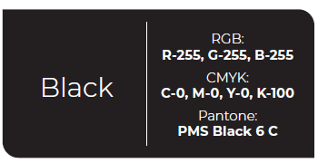
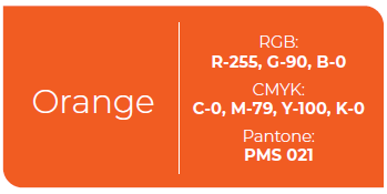
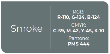
Proper use of color is a critical element in maintaining a brand identity. The RCC brand identity consists of three primary colors: orange, black, and smoke. The logomark and logotype must always be reproduced using this color palette. The primary RCC logomark and logotype should be used on a white background. When necessary, the white version of the logo may be used on dark-colored backgrounds such as black, orange, and smoke. The primary logo should never be used on a multi-colored background.
The Logo on Color
When the RCC logo is used on color backgrounds, typically it should be printed in WHITE or BLACK. The RCC logo should never be used on a multi-colored background. Consult the Marketing Department or District Graphics for proper usage on color backgrounds.
RGB: Red, Green, Blue color file primarily used for images created for electronic purposes such as email, web, and PowerPoint.
CMYK: Cyan, Magenta, Yellow and Key (black) which are the key words used for some four-color process printing.
Pantone: Pantone Color Matching System (PMS) is the print industry color code numbers for exact color match used in four color process printing.
Secondary Colors
The RCC brand identity includes a secondary color palette. These secondary colors may be used to support the primary brand when additional colors are necessary to help define or create hierarchy or differentiate design elements.

Program Colors
Departments and programs are supported by academic pathways. This extended color palette is used to differentiate those pathways. These colors are directed at the campus community and will help organize information and minimize design confusion. These colors should be subordinate to and support the RCC brand.
